
 HANDS ON SharePoint
 HANDS ON Teams
 HANDS ON Lists
 HANDS ON tek
 M365 Admin
Updating the look and feel of OneDrive
We’re making a small set of visual updates to OneDrive to help align the product with the latest iteration of Microsoft’s design language. Microsoft uses the Fluent design system to ensure a cohesive and accessible design for all Microsoft products and users.
When this change is released, you will notice an updated color palette, refreshed icons, increased opacity for drop shadows, and rounded corners for square graphical elements.

When will this happen:
• We will begin rolling this out to Targeted Release customers in late March.
• We will begin rolling this out to Standard Release customers in early April.
• We expect the rollout to be completed by the mid-April.
How this will affect your organization:
This update will make slight visual changes to OneDrive. These small changes are designed to increase usability and accessibility.
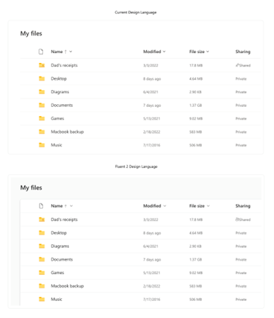
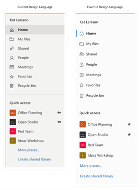
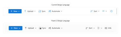
Here’s a before-and-after look at some of these changes:
Files Container
Left Navigation
Command Bar
What you need to do to prepare:
You may consider updating your training and documentation as appropriate.
Learn more about Microsoft’s Fluent design system.
Message ID: MC530466


No comments yet